
纯css实现输入框placeholder动效及输入校验的示例代码
文章主要介绍了纯css实现输入框placeholder动效及输入校验,文中通过示例代码介绍的非常详细,对大家的学习或者工作具有一定的参考学习价值更多精彩内容请关注 https://github....
文章主要介绍了纯css实现输入框placeholder动效及输入校验,文中通过示例代码介绍的非常详细,对大家的学习或者工作具有一定的参考学习价值
更多精彩内容请关注 https://github.com/abc-club/free-resources
背景
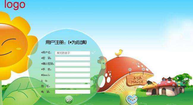
话不多说,我们能否用纯css实现以下效果:
答案是肯定的。
借助css:placeholder-shown :valid :invalid伪类及html5 input pattern 属性就可以实现
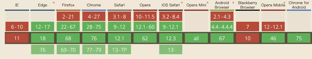
:placeholder-shown伪类目前兼容性如下:
直接上代码!☺️
源码
https://jsbin.com/qenucaz/edit?html,css,output
html:
<!DOCTYPE html>
<html>
<head>
  <meta charset="utf-8">
  <meta name="viewport" content="width=device-width">
  <title>JS Bin</title>
</head>
<body>
  <div class="input-fill-box">
    <input class="input-fill" placeholder="邮箱" pattern="^[A-Za-z0-9\u4e00-\u9fa5]+@[a-zA-Z0-9_-]+(\.[a-zA-Z0-9_-]+)+$" required>
    <a href="javascript:" class="clear">close</a>
    <label class="input-label">邮箱</label>
</div>
</body>
</html>
css:
.input-fill{
  width: 100%;
  margin: 0;
  font-size: 16px;
  line-height: 1.5;
  outline: none;
  padding: 20px 16px 6px;
  border: 1px solid transparent;
   background: #f5f5fa;
  border-radius:10px;
  transition: border-color .25s;
}
.input-fill:placeholder-shown::placeholder {
    color: transparent;

}
.input-fill-box {
  width: 50%;
    position: relative;
}
.input-label {
    position: absolute;
    left: 16px; top: 14px;
    pointer-events: none;
    color:#BEC1D9;
   padding: 0 2px;
    transform-origin: 0 0;
    pointer-events: none;
    transition: all .25s;
}
.input-fill:not(:placeholder-shown) ~ .input-label,
.input-fill:focus ~ .input-label {
    transform: scale(0.75) translate(0px, -14px);
}
.input-fill:focus{
  border: 2px solid #1d31aa;
}

.clear{
  position:absolute;
  top:10px;
  right:-20px;
   display: none;
    transition: all .25s;
}
.input-fill::-ms-clear { display: none; }
.input-fill:not(:placeholder-shown) + .clear { display: inline; }

.input-fill:valid {
 border-color: green;
 box-shadow: inset 5px 0 0 green;
}
.input-fill:not(:placeholder-shown):invalid {
 border-color: red;
 box-shadow: inset 5px 0 0 red;
}
关于CSS中@support实现渐进式网页设计实例代码
文章主要给大家介绍了关于CSS中@support实现渐进式网页设计的相关资料,文中通过示例代码介绍的非常详细,对大家学习或者使用CSS具有一定的参考学习价值前言特性查询赋予了我们...
CSS transition animation的使用(内含贝赛尔曲线详解)
文章主要介绍了css transition animation的使用(内含贝赛尔曲线详解),文中通过示例代码介绍的非常详细,对大家的学习或者工作具有一定的参考学习价值,区别:transition也叫过渡动画...
CSS自适应布局实现子元素项目整体居中/内部项目左对齐示例代码
文章主要介绍了CSS自适应布局实现子元素项目整体居中,内部项目左对齐,文中通过示例代码介绍的非常详细,对大家的学习或者工作具有一定的参考学习价值,日常工作时,我们可能遇到这...
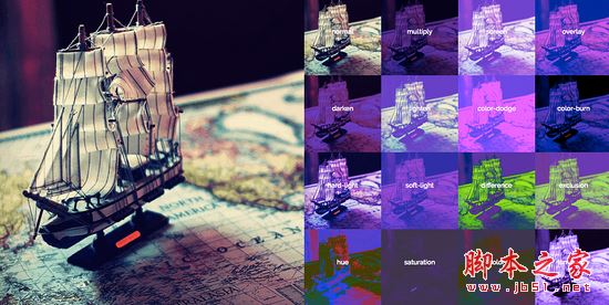
使用CSS混合模式和SVG来动态更改产品图片的颜色
文章主要介绍了使用CSS混合模式和SVG来动态更改产品图片的颜色,需要的朋友可以参考下。前两天在Codepen看到了@Kyle Wetton写的一个示例, 使用CSS混合模式和SVG来改变沙发的...

css新手教程之背景图充满整个屏幕的示例代码介绍
文章主要给大家介绍了关于css新手教程之背景图充满整个屏幕的相关资料,文中通过示例代码介绍的非常详细,对大家学习或者使用css具有一定的参考学习价值。想让整个界面有一个背...
网页设计:浅谈网页基本性能优化规则小结
这篇文章主要介绍了浅谈网页基本性能优化规则小结的相关资料,小编觉得挺不错的,现在分享给大家,也给大家做个参考。一起跟随小编过来看看吧...

用户需求导致营销型网页设计
我们的每期话题,团队在内部都会通过邮件进行一番讨论,随着讨论的激烈,往往能碰撞出很多有意义的观点,因此,将讨论内容分享出来,有兴趣的朋友可以接着话题讨论下去。Junchen:期望不是从石头里面蹦出来的,所有期望都是受到外界影响、结合自身需求的一个外在表现...
网页设计栅格就是你对页面版式的规划
英文原文:http://desktoppub.about.com/od/grids/l/aa_gridsorder.htm栅格就是你对页面版式的规划你日常所见的许多页面都有栅格存在。你可能注意不到,但它确实存在,并且支撑着设计内容,建立整体的架构,引导着页面的元素。栅格是隐形的架构,用于指导你页面...
网页设计内容网页中关于图片预览的设计
之前有写过《内容页页码的预览导航》跟《照片预览导航分析》两个文章,想说明的是预览这一功能在用户心理所占有的比重是很大的,如果仅仅只是给出一排顺序数字做为链接的标题,用户的心理会产生不安全感。虽然给出一排顺序数字做为链接几乎是整个互联网的默认分页链接模...
网页设计:脚本素材重构用户体验
设计网站的同志背景主要有两种:学计算机、学艺术。基本上会写代码的不懂设计,会设计的不懂代码,这个格局似乎到今天还没变。某些学计算机的同学,有自己的审美品位,也能够做出看起来不错的网站,但学艺术的同学普遍难搞懂代码...